mrbreeze
New Member
 Ragin' Rednecks
Posts: 19
|
Post by mrbreeze on Sept 11, 2007 22:05:36 GMT -5
I have a request. Y'all had created me a logo for a league. The Beer and BBQ Fantasy League. The text on the top of the logo appears to be turning from left to right... can you square up the text at the top, please 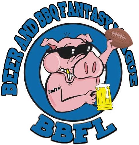 I added the Tattoo to the pigs arm... Its in memory of my Dad who started this league, "PeePaw" is what all his friends call the original Commish of the BBFL... just hope I'm doing it justice.... |
|
|
|
Post by Game Time on Sept 21, 2007 19:26:30 GMT -5
slightly different look... thoughts  |
|
mrbreeze
New Member
Ragin' Rednecks
Posts: 19
|
Post by mrbreeze on Sept 27, 2007 7:42:57 GMT -5
I like it, but I think i prefer it the other way, larger. I just would like to see it not turned, if you know what i mean. It looks like Beer is close and League is back... i would like to see them even..
|
|
|
|
Post by Game Time on Oct 1, 2007 19:59:58 GMT -5
|
|
mrbreeze
New Member
Ragin' Rednecks
Posts: 19
|
Post by mrbreeze on Oct 1, 2007 20:18:45 GMT -5
absolutely perfect.... thanks ;D
|
|