|
|
Post by SnakeEyes on Jul 11, 2006 12:11:28 GMT -5
Wow, that is a major upgrade. Thank you very much. The last thing I want is to be picky, but could you put a football on there somewhere?  |
|
|
|
Post by ronmexico on Jul 11, 2006 12:16:20 GMT -5
That is sweet. Thanks.
|
|
|
|
Post by realityfootball on Jul 11, 2006 12:21:04 GMT -5
|
|
|
|
Post by realityfootball on Jul 11, 2006 12:21:49 GMT -5
BTW, Susquehanna is a pretty river.
|
|
|
|
Post by ronmexico on Jul 11, 2006 12:43:16 GMT -5
Could you put the SFFL at the top where the lettering currently is and put a football on the river?
BTW, the Susq. is much cleaner than it was 15 years ago which makes it nice !!!
|
|
|
|
Post by realityfootball on Jul 11, 2006 13:08:06 GMT -5
|
|
|
|
Post by ronmexico on Jul 11, 2006 13:14:13 GMT -5
That is Sweet !
I'm good to go with the SFFL logo.
------------------
I'm holding out hope that the AFL one can have the two rivers on either side of the mountains, then this thread can be locked.
Thanks again guys. You'll get referrals from me.
|
|
|
|
Post by realityfootball on Jul 11, 2006 13:34:52 GMT -5
 This sort of continues along with the theme of abstract shapes in the logo. |
|
|
|
Post by ronmexico on Jul 11, 2006 14:07:47 GMT -5
I'll take this, but is there anyway to stretch the "rivers" out a little bit more so they have a little more visual effect?
|
|
|
|
Post by ronmexico on Jul 11, 2006 14:16:29 GMT -5
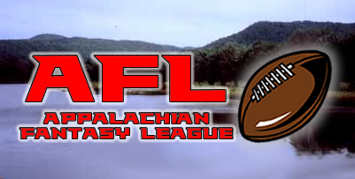
Ok...let's try this angle (and I appreciate your diligence). On this URL...is there anyway to take the fisherman out (or put AFL) over him? Maybe put AFL on the water with a football in some way (similar to the SFFL football is laid out0? Hell, you can just do the same thing as you did with the SFFL, but with the AFL on this picture... www.deerwooderentals.com/newready/lake02.jpg |
|
|
|
Post by realityfootball on Jul 11, 2006 14:17:57 GMT -5
Stretch the rivers = thicker or Stretch the rivers = longer  |
|
|
|
Post by ronmexico on Jul 11, 2006 14:19:04 GMT -5
see my post above. The SFFL log is so nice, I'd like to just duplicate it, but using the picture above.
|
|
|
|
Post by realityfootball on Jul 11, 2006 14:34:15 GMT -5
 Aesthetically, I still think you are better off going with abstract forms over photorealism, but here you go anyway.  |
|
|
|
Post by ronmexico on Jul 11, 2006 14:43:02 GMT -5
ok...use the aesthetically better abstract logo. What I mean by stretching was to make them longer, not wider.
|
|
|
|
Post by realityfootball on Jul 11, 2006 14:49:10 GMT -5
Actually, I kind of like how the new lakeside one turned out. But I'll give the abstract one another try too.
|
|