|
|
Post by NFFLcomish on Jul 18, 2007 20:22:57 GMT -5
Ok, let me start by saying I have ZERO experience with graphics. Since I put out the idea for GT, I thought I would have a little fun playing around with Paint Shop Pro. I know whatever GT does with this will be 1000 times better, but I just wanted to try my idea out for my first graphic experience. I will not feel bad if you hate it because I am a rookie at this, and I expect GT's to kill mine! The Japanese symbols are Kanji and actually are the symbols for the word 'Kamikaze'. Here it is. Again its ok to hate it, because its my first one!  |
|
|
|
Post by Game Time on Jul 18, 2007 21:55:45 GMT -5
real nice....the only thing (if being picky) is the flag and writing need to be angled to make them look like they are really there.... like i said though, real nice.....
|
|
|
|
Post by NFFLcomish on Jul 18, 2007 21:59:37 GMT -5
Yeah see I don't know how to do any of that stuff! Thats why you are still the boss around here! I was just bored and wanted to try something...thanks for the advice, I will try to play with it more, but I don't know what I am doing!
|
|
|
|
Post by limedes on Jul 19, 2007 10:34:06 GMT -5
hey, wow, that does look really good!!! I'm liking it. So, if you can get the flag and writing angled, I think it will work out great. Also, if its possible to put the plane at a steeper down angle, that would be sweet. Thanks for all your help!
|
|
|
|
Post by NFFLcomish on Jul 19, 2007 18:04:51 GMT -5
I tried to play with the flag and writing more. In turn I thought that the writing looked better up and down. And the flag is somewhat at a differernt angle, but I don't know if that is what you and GT were talking about, I had a hard time with that, as I truly don't know enough about this. I may have to defer to GT if you don't like that! The steeper angle may be too steep just let me know! 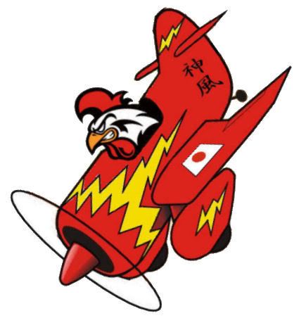 |
|
|
|
Post by limedes on Jul 19, 2007 21:41:15 GMT -5
Yeah, maybe lessen the steepness a little. As far as the flag goes, still doesn't look completely right, but I don't know what you would have to do to make it look right. Might need GT's help with that? Other than that, I think it will be good to go!
|
|
|
|
Post by NFFLcomish on Jul 19, 2007 21:53:54 GMT -5
I will work on it again tomorrow! I will probably need GT's help, but I will give it another shot after work tomorrow!
|
|
|
|
Post by NFFLcomish on Jul 20, 2007 22:44:34 GMT -5
Is this any better? The angle will be different once on a helmet too! 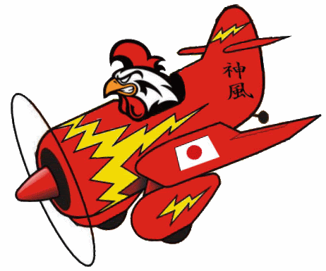 |
|
|
|
Post by limedes on Jul 21, 2007 0:22:25 GMT -5
Yes, that is better! I think it is ready for the helmet! Thanks
|
|
|
|
Post by NFFLcomish on Jul 21, 2007 7:13:10 GMT -5
Here are two options for a helmet. A Yellow and Black. Not sure which one I liked better so I gave you both options. Let me know! 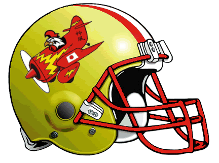 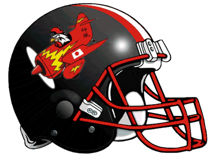 |
|
|
|
Post by limedes on Jul 21, 2007 11:16:30 GMT -5
Neat...I really like both of those. Thanks for trying out the two different colors. They both look really good. I think I will probably end up going with the yellow one, it is a hard choice though. Thanks for all your hard work on it...it turned out great!
Here's the next helmet:
Team Name: Bunches-n-Bunches of Bunnies (lol)
Maybe you could find a group of bunnies, a basket of bunnies, or even better, just cover the whole helmet with bunnies. I don't want them real friendly looking, so maybe a little aggressive looking if possible.
|
|
|
|
Post by NFFLcomish on Jul 22, 2007 13:44:14 GMT -5
Yeah I really liked doing this! It was fun for my first attempt, and now I am just trying to learn by doing others as I go! I personally like the yellow myself because there aren't a ton of helmets like that...lots of black! Now onto the bunnies... what about this logo -  Do you prefer any certain colors for the helmet? I was thinking with that logo, maybe try to layer a bunch of the same guys over and over again, starting from smaller to bigger...giving the look of bunches-n-bunches of them?!? Or of course him by himself. Or color that logo different colors and place a few of them together. Anything along there sound good, or should I find a different logo? |
|
|
|
Post by NFFLcomish on Jul 22, 2007 14:30:15 GMT -5
Here is another with a bunch of bunnies on it. With the mean guy in the front... just let me know which direction to go and I will get to work on it!  |
|
|
|
Post by limedes on Jul 22, 2007 20:36:30 GMT -5
That is a cool group of bunnies. I'm trying to decide which way to go. I like your idea of using the one over and over again, layering them and making them get bigger. It would probably look silly to do that with the group of bunnies, you think? If you think that that would look silly, try it with just the one please! I don't have a preference for colors, whatever you think looks good. Thank You  |
|
|
|
Post by NFFLcomish on Jul 22, 2007 20:47:52 GMT -5
Sounds good, I will play with these ideas for a bit and try to come up with something good for you!
|
|