|
|
Post by c17mitch on Jul 15, 2007 10:21:56 GMT -5
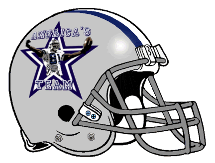
PERFECT!!! Exactly what I was looking for! For the next I'd like to use the following picture of TO: cowboys.beloblog.com/archives/star.jpgCan I get the picture of him put on a Dallas Cowboy helmet? Is there anyway to make the picture look more like a cartoon? Can we make him standing on the star of the helmet? Thanks! |
|
|
|
Post by Game Time on Jul 19, 2007 21:48:04 GMT -5
i can't turn that into a cartoon....
|
|
|
|
Post by NFFLcomish on Jul 19, 2007 22:18:11 GMT -5
Here is a funny TO cartoon guy. Maybe remove the 'baggage' which is funny to leave on there, and of course change his pants from philly to dallas?!?  |
|
|
|
Post by c17mitch on Jul 20, 2007 8:30:05 GMT -5
That's cool. It doesn't have to be a cartoon. If this picture of him is too big, it might be best to cut him off at the torso and put it on the star of the Dallas helmet. I like the cartoon musicboy posted too. I'll take whatever is easiest. If we go with the cartoon, maybe we could replace the suitcase with "America's Team" in this font: www.dafont.com/jersey-letters.font?nb_ppp=50&text=America%27s+Team |
|
|
|
Post by YC on Jul 23, 2007 19:01:09 GMT -5
Not cartoonish...but kinda like a drawing/painting.....
thoughts on this....
|
|
|
|
Post by c17mitch on Jul 23, 2007 22:23:20 GMT -5
|
|
|
|
Post by YC on Jul 24, 2007 8:06:18 GMT -5
thoughts.... 
|
|
|
|
Post by c17mitch on Jul 24, 2007 9:39:59 GMT -5
|
|
|
|
Post by NFFLcomish on Jul 24, 2007 18:03:35 GMT -5
How is this?  moved this topic to here because it seems like we are doing mostly helmets! Now I can pay attention to it better! |
|
|
|
Post by NFFLcomish on Jul 24, 2007 18:44:35 GMT -5
|
|
|
|
Post by c17mitch on Jul 25, 2007 20:36:52 GMT -5
He likes the last picture, but he's afraid it's too faded looking. His preference is for a Joe Camel picture or that last one if it can be made more clear. Thanks!
|
|
|
|
Post by YC on Jul 25, 2007 22:25:00 GMT -5
did a quick search and found an additional one...

a cleaner version of the one that was inquired about...

not pertaining to the logo...but too funny not to share....

|
|
|
|
Post by c17mitch on Jul 25, 2007 22:36:21 GMT -5
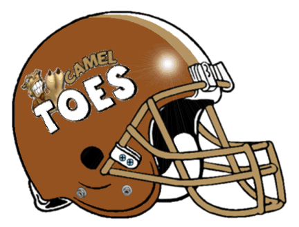
I really like the new one on top! Can we change "Mr. Camel Toe" to Camel Toes? Thanks!
|
|
|
|
Post by NFFLcomish on Jul 27, 2007 16:18:22 GMT -5
I really like the way this one came out. Tried to stay with the colors of the logo for the helmet. If your buddy wants a different color helmet just let me know...  Logo if needed...  |
|
|
|
Post by c17mitch on Jul 27, 2007 16:29:34 GMT -5
I really like the bottom logo (the helmet looks a bit fuzzy). Can we try the bottom logo on a white helmet with a gold (same color as the word "camel") stripe. Looks sharp!
|
|